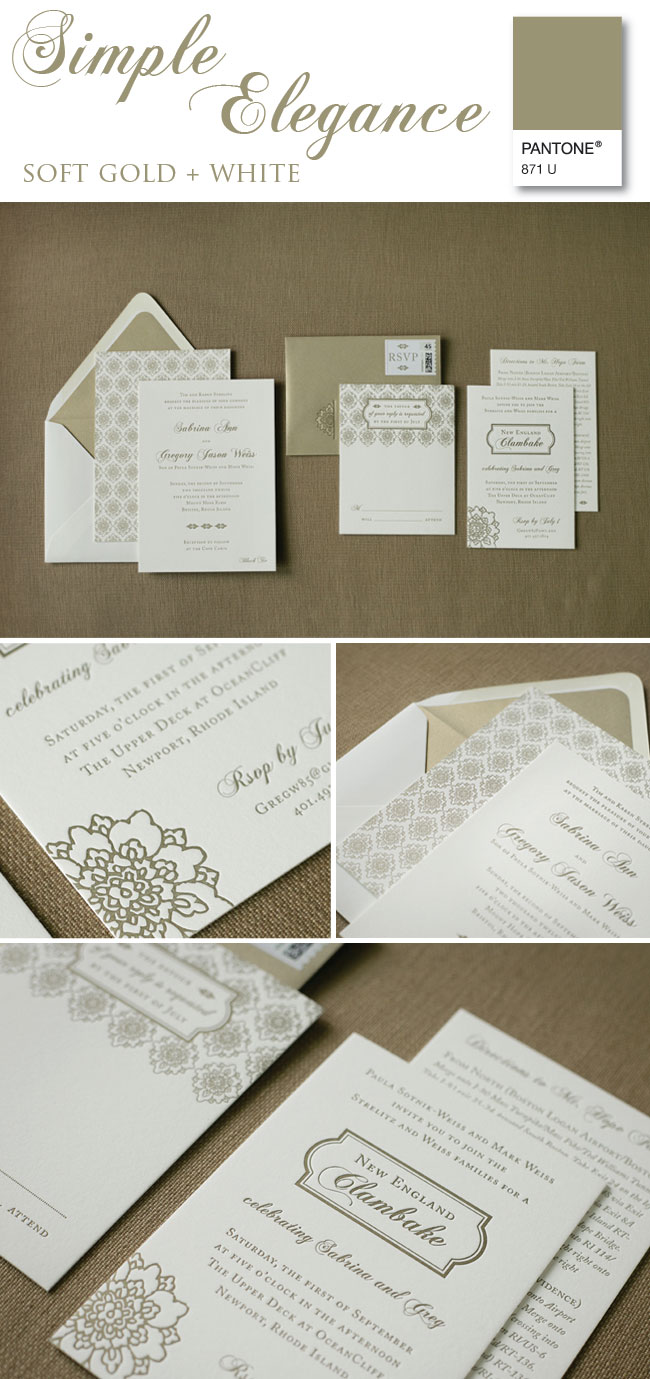
One of our favorite colors for invitation suites is printing in a soft gold. This is perfect for a neutral color palate {champagne, blush, white, cream, etc} or even a palette that's still in the works! Soft gold ink allows the typography and designs to carry the formality- it's a win/win! Sabrina & Greg's invitation suite was created to set the tone for their black tie affair at Mount Hope Farm. While we're eagerly awaiting the feature of their stunning day to go live, I couldn't resist sharing their suite- complete with double thick cotton paper, a patterned backing on the invitation, a shimmery envelope liner and of course, custom postage!
*Photos courtesy of Laura Ashbrook Photography