Just the other week the ladies of Paper Moss had the chance to get fancy and celebrate the release of the latest issue of Bliss Celebrations Magazine. Do they EVER know how to throw a release party! Take a peek at some of the pretty pages… and definitely peruse the whole issue {here} when you have time!

Gold is our favorite neutral color right now… and it's a perfect compliment to nearly every palette! We topped off Lyla & Max's soft gold letterpress suite {shown below} with tangerine painted edges for a sassy pop of color!

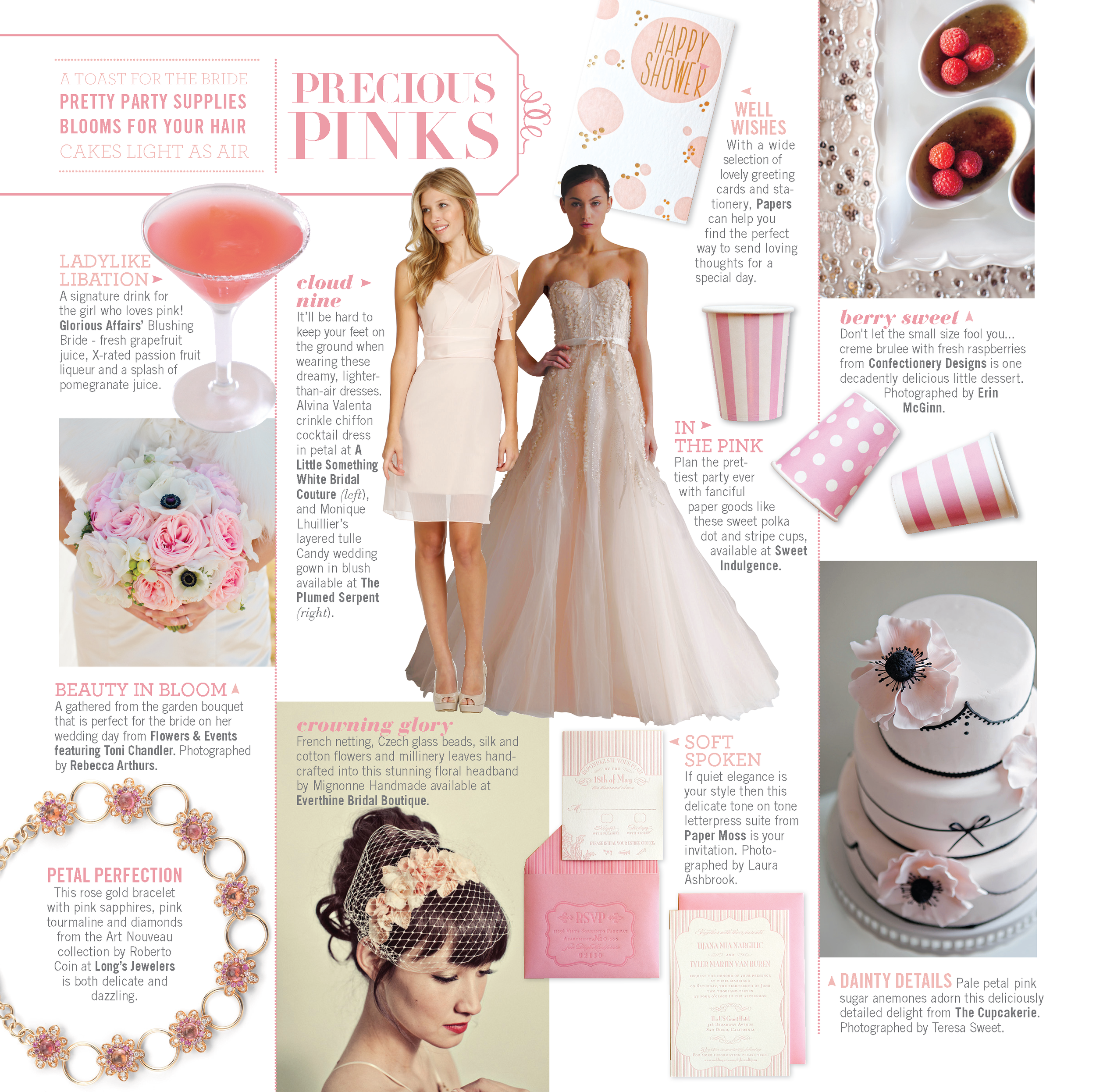
A pretty pink palette can create an ambience ranging from romantic to fun. Tyler & Tijana's tone-on-tone letterpress suite was inspired by Chanel and we combined both stripes, floral and unique frames to keep the eye moving throughout the suite.
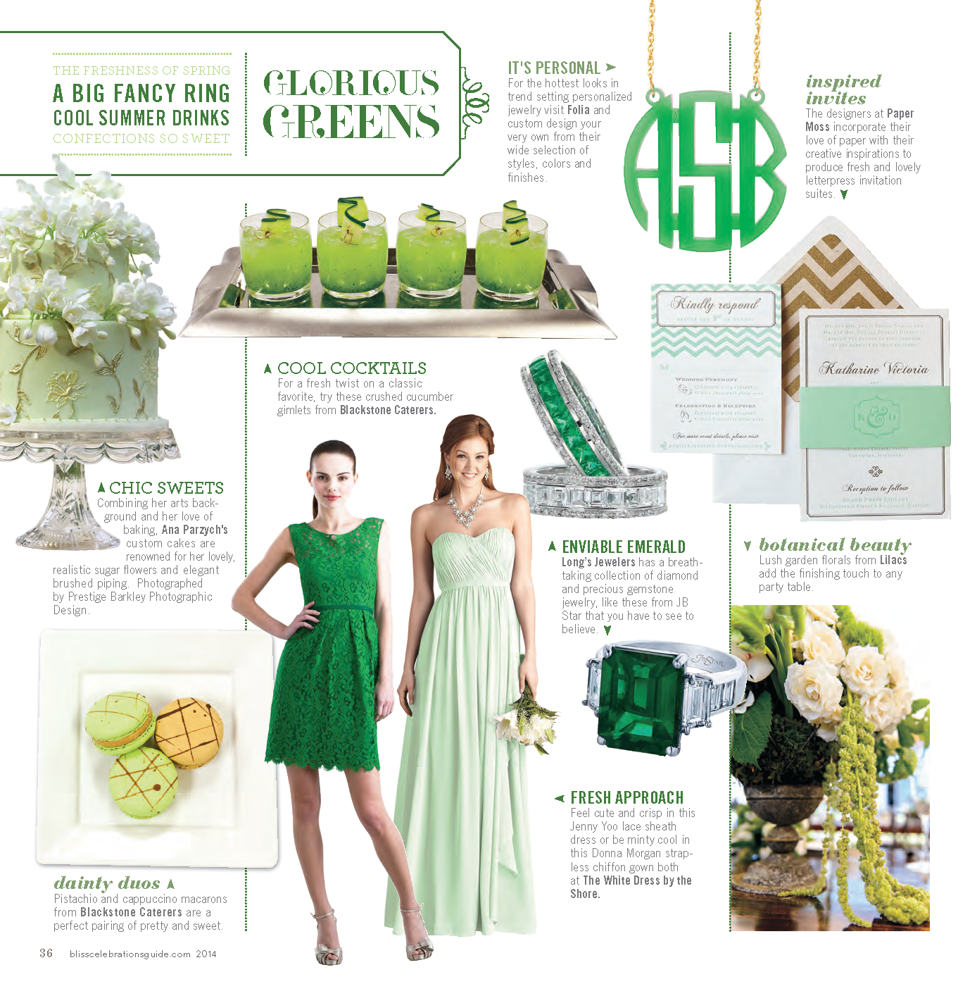
From mint to emerald, we've had some fabulous green invitation suites these past few months! Katharine & Daniel's mint & gold letterpress invitation suite features playful chevron, cute icons and a fun monogram which was carried throughout their day of materials!


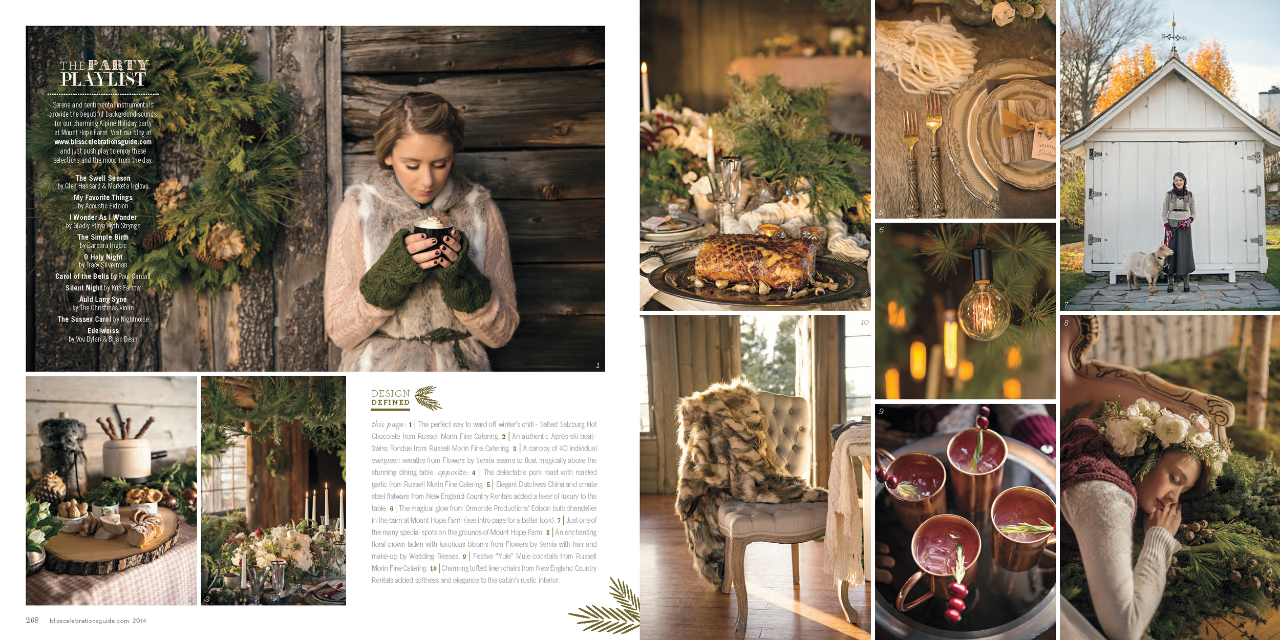

As if those color round ups aren't enough inspiration, we collaborated with Bliss Celebrations on this gorgeous, rustic Alpine Woods inspiration shoot! Though we're heading into spring at this point, the rich colors and cozy textures have our minds already spinning with ideas for next winter and fall!