1 | 2 via Pinterest | 3
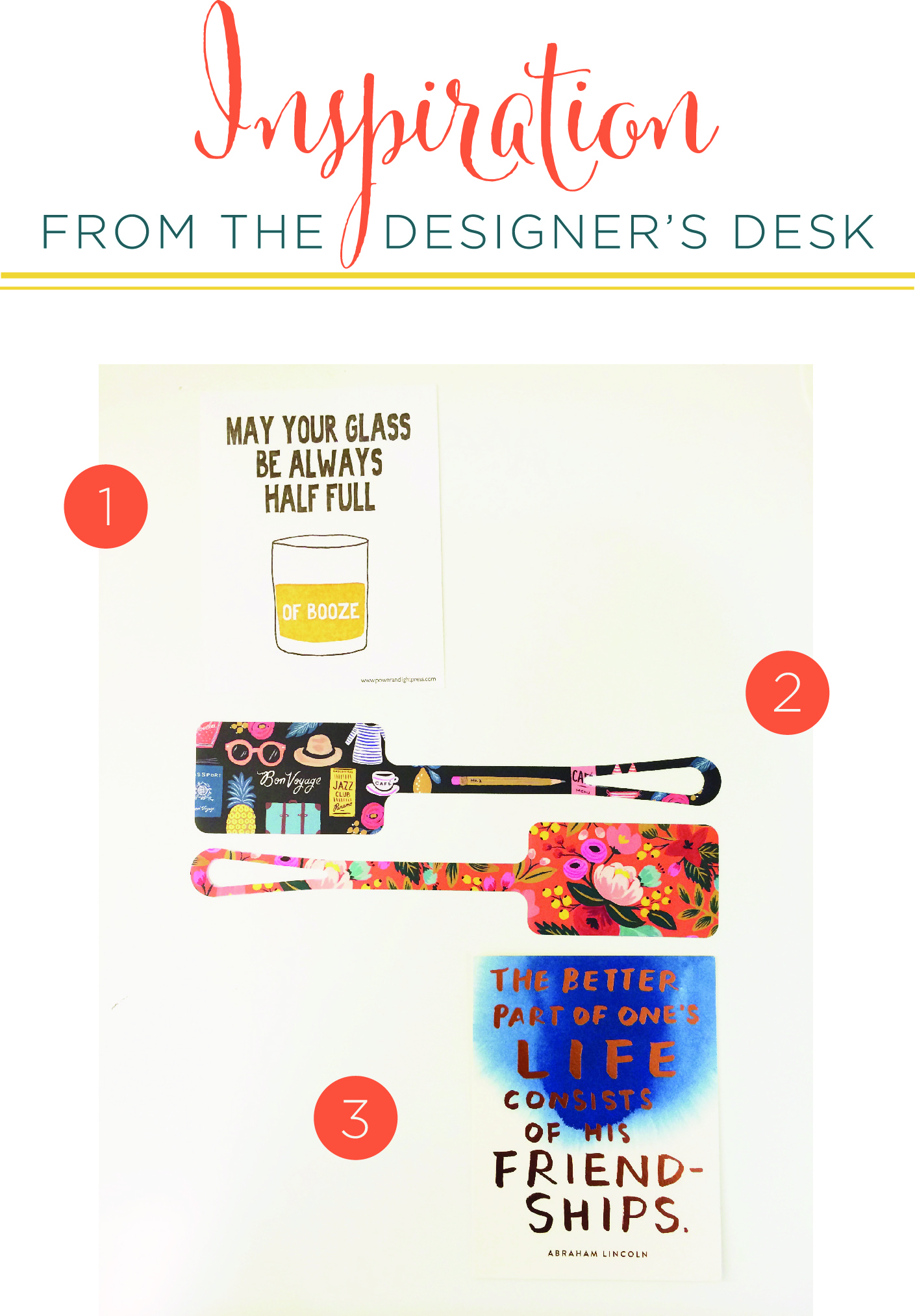
We at Paper Moss, are excited to change things up! Today we are bringing you a new perspective of inspiration and creativity from the desk of the Paper Moss Design Team.
Hi everyone! I am Caitlin, a designer at Paper Moss. This week's inspiration from my desk is all about Spring. I for one love all the seasons, but cannot wait for the sunshine to come out after this very cold New England winter. I have been dreaming of cute dresses, fresh flowers and lots of color!
Lisa Hedge'swork on these Save the Dates is exactly what I needed to stir my creativity. They are simple and yet vibrant and alive. Hedge, an art director at Partner's & Spade is genius. Her work can be seen in our everyday, like J. Crew's website and sketches, as well as everyone's favorite eyeglass frame company: Warby Parker's. Hedge created their print branding to sync with their business model and simple store fronts. Her simple elegance is what I want to help reign in this coming season, as I de-clutter my mind and my closets and welcome spring.
I am in love with the mixing of a floral pattern with a stripe or a plaid like this outfit from On the Rack's Laura Ellner. As a savvy fashionista and stylist, I will take her advice on dress pairings any day.
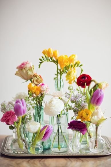
Inspiration is everywhere, and spring isn't spring without flowers and walking outside and hearing the birds chirp. But why not bring that all inside and surround ourselves with nature wherever we are? Rubi from She Lets Her Hair Downinspired me to do just that, as she created a wall paper of sorts in her home. Flowers do not just have to be in a vase or jar to make a room feel more organic and bright. This could be a great way to showcase a deconstructed bridal bouquet!
I hope spring decides to come earlier this year so I can continue to be inspired by the colors and fresh florals of the season. What inspires you this week as the weather changes and the air starts to get warmer?
Until next time, from the designer's desk!
xo
Caitlin