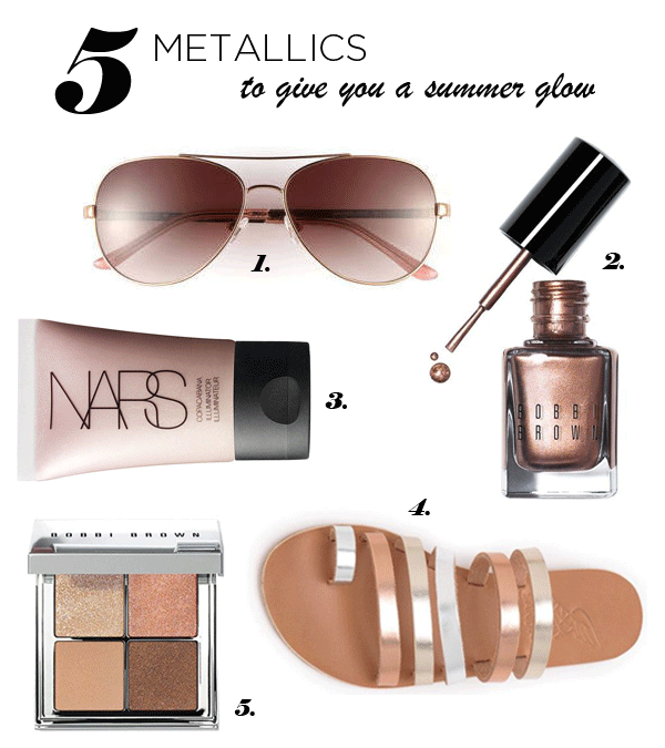
4 wedding accessories you'll want

A lot of couples that we've been meeting with lately are working with bright and punchy palettes for their wedding day. I love the emphasis that this puts on the wedding being a celebration... and all of the fun & chic party ideas that come along with it. Leave it up to BHLDN to be a trend setter for some of our picks (those flamingos!) but wherever you look, there seems to be fun, colorful accessories popping up all around the wedding market.

clockwise from top left: via | via | via | via


Pineapples, stripes & sunshine

Today is the day I have long been waiting for. Dan and I are headed to Puerto Rico for some sun, relaxation & quality time. In anticipation of some serious sunbathing, I've been searching high and low for some stylish beach necessities. One summer trend that I am LOVING right now, are the pineapple prints that are popping up on everything! I just got a pineapple patterned shirt the other day and came across this adorable little 2- piece from Top Shop that I don't particularly want to live without. ;) And since a good beach blanket is a must have for the summer, this one from Madewell is totally worth the splurge. Enjoy perusing and be inspired to plan a trip to the beach this weekend!!

1 | 2 | 3 | 4 | 5

Happy weekending!

Summer tunes

How was your weekend, friends? Ours was long but productive. I'm not gonna lie, my feet are dragging today and I need a little pick-me-up to help jump start the week! Naturally that happens with (1) coffee and (2) music. After asking a handful of friends what their favorite summer songs are, I put together this little playlist. Haters of country music, proceed with caution. Apparently warm weather calls for a little twang and some good old school hits. Check it out! :)

{Turn up the heat}

Featured: Galen & John

Friends, we just got word that one of the weddings that we worked on last year was featured on none other than Style Me Pretty! Galen & John's wedding took place at Muskrat Farms in Rhode Island and we knew the tented affair was going to be romantic and every bit ethereal. As we worked on their invitation suite using soft colors, whimsical hand calligraphy, a textile inspired envelope liner and a little muskrat icon, we quickly fell in love. The couple worked with Exquisite Events to design & execute their day and every little detail was captured with precision by the fabulous folks at First Mate Photography.

GJ-SMP.png

Naturally, we feel compelled to share their gorgeous letterpress invitation suite, featuring hand calligraphy by the lovely, Kristen Henderson...

30e28b51706a6bbd8696a54c231480c3.jpg

And incase you foolishly decide to not hop over to SMP to soak in the beauty of the whole feature, here are a few detail shots which of course include 2 of the "day-of" stationery items that we designed for them!

GJ-feature.png

We're beyond thrilled to have this wedding featured. A huge congrats to the happy couple- it was an absolute pleasure working with you!

galen-john.jpg

Take a look a the whole post here... and one last THANK YOU to First Mate Photographyfor doing such a killer job capturing this!

Monogram it!

Not everyone gets pumped up about monograms the way that we do, but when a bride knocks on our door in need of a one uniquely tailored to them, we JUMP at the chance! This is actually one of the things we love most about working with clients- designing a custom monogram that we can use throughout the invitation suite and incorporate into their wedding day materials. These little works of art vary in style and amount of detail included, depending on what each couple wants. Take a peek at some of our favorite monograms that we designed in the last few years, ranging from simple to complex... and from modern to rustic!

Which one is your favorite?

To learn more about general monogram etiquette, check out what our friends at Mark and Graham have to say {here}!

Metallic foil & a summer glow

Lately we've been designing a lot of suites that feature the warm glow of metallic foil printing. You better believe we get pumped up about the yellow gold & rose gold color trends, but we're also seeing more silver lately. While we adore seeing designs letterpresses in these bold metallics, we also know that they represent the sun kissed summer palette that we're looking forward to! Since last weekend brought us our first GORGEOUS weekend of the year, we're planning our attack of all things bronzed & beautiful, and here's what is on our list:

1 | 2 | 3 | 4 | 5


National Donut Day!

As a little girl, there was nothing better than scoring a pink, frosted donut covered with sprinkles. It's a good go-to. Well in the past few years, donuts have become the new "cupcake" and we're LOVING all of the specialty shops that feature creative flavor combos. Voodoo Donuts in Portland, Oregon happens to be my favorite spot. If you ever have the chance, PLEASE go there and try their crazy flavors! In celebration of this national holiday, we put together a round of delicious recipes that we're dying to try making at home:

Recipes are in order of appearance, from left to right: French Breakfast Donuts | Strawberry Shortcake | Devils Food | Rock Candy | Vermont Maple

If you're pumped to celebrate and want to do so by NOT baking, here are 6 places that are handing out free donuts today! Have a fabulous weekend, friends!

Decoding escort cards & place cards

Lately, we've been getting a lot of questions about the proper etiquette of escort cards and place cards. There is no better time than NOW, to clarify when to use which type of card {they're often confused} and address some of the minutia, in effort to make that aspect of the wedding planning process easier. This chart is a starting point to tackle some commonly asked questions:

Happy planning!

Say yes to color

When it comes to Spring, you can't go wrong with mixing bright colors. This can be applied to many design mediums- fashion, home decor, stationery... and in this case, florals! We wanted to jump start the week with this super fun, look that we caught over on the Peaches & Mint blog. It has been stirring up inspiration in our office, and we're rearing to group together different sizes of bottles, vases, cups and bowls and give this a try! What a beautiful look for the home, office or even for a sweet party decoration.

We love being reminded that things don't have to be "matchy" or symmetrical to be beautifully designed! Happy Monday!!

*Photo courtesy of Peaches & Mint

A lesson in typography

To say we love typography is an understatement. We at Paper Moss have been known to play "what's that font" on a day-to-day basis, with any random thing we see. Menus, signs, t-shirts... PRICE TAGS! Yea, it's a habit. Today we're nerding out and sharing some fonts that we're currently loving. So, take notes and perhaps next time we're in the same room you can beat us at our own, embarrassingly ridiculous game?! Or not... ;)

Seriously though, happy Friday!

BBQ, freedom and giving thanks

Friends, it's the 3-day weekend we've been waiting for! Whatever you have planned for today, don't forget to take some moments to acknowledge the brave men and women who died while serving in the armed forces. How amazing it is to live in a free country!

Now go get your barbecue on! ;)

From the Designer's Desk: National Stationery Show


1 | 2 | 3

I can't even begin to share the joy that I was filled with while attending the National Stationery Show in New York City this past weekend! It was a whirlwind of amazing color, paper, designs, and people!! Walking up and down the aisles meeting with new (and returning) print & design companies, paper vendors, and so much more, sparked the creative buzz in my head.

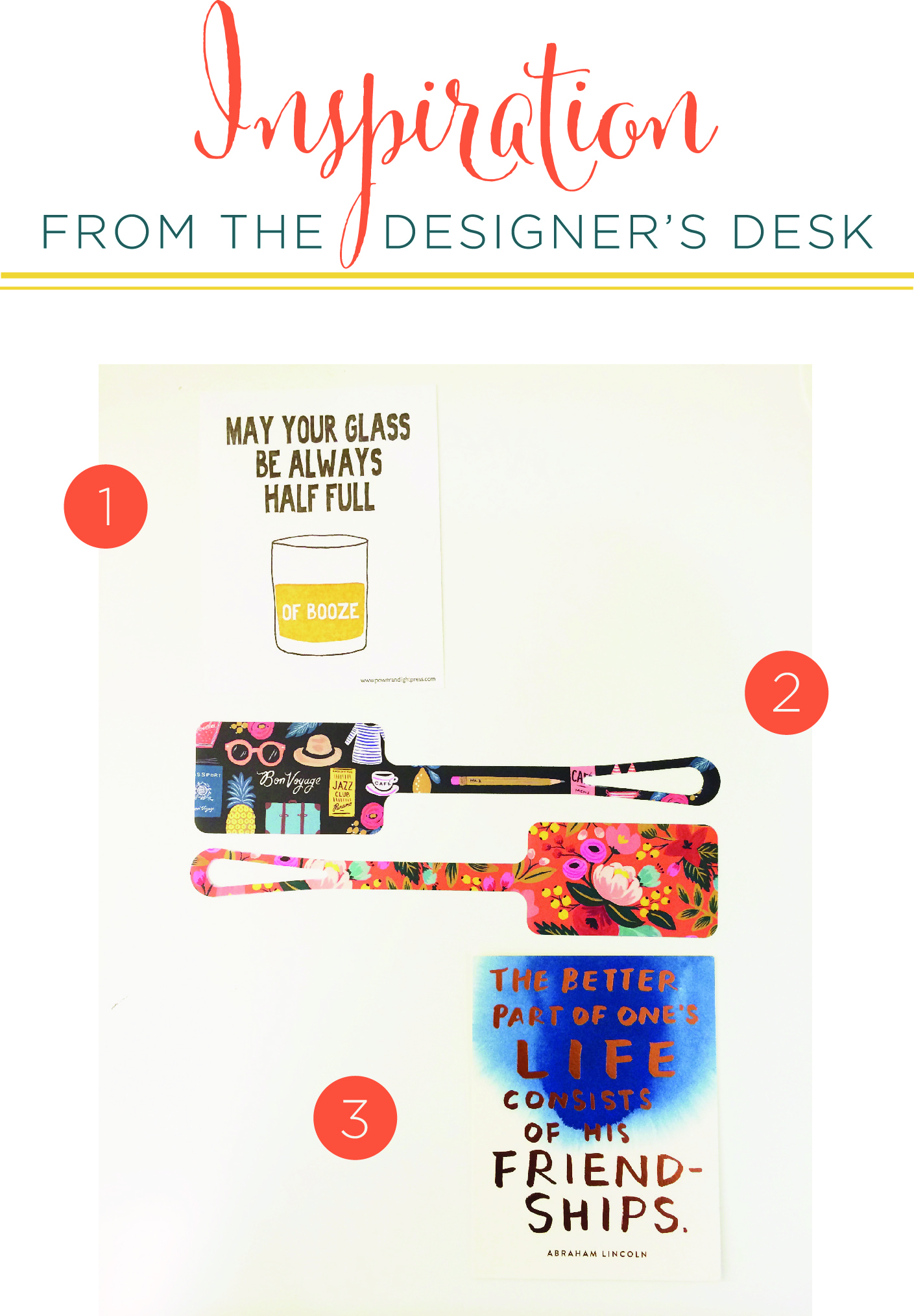
What I love most about the NSS is to be able to see how these amazing creatives have their own voice…and stick to it! There is nothing more beautiful then seeing the hard work of artists come out in their work. Just a couple of my favorite freebies from the show include two great frame worthy cards from Power and Light Press and Sycamore Street Press (who doesn't love a good copper foil?!?). And of course, luggage tags from Rifle Paper Co.

These artists, collaboratives, and business owners are truly inspiring to keep creating and stick to what I know and what I love. Passion and verve will always create the best stuff.


Until next time, from my desk to to yours!

xo

Caitlin


It's finally here!

Today, is a day we've been waiting for all year. The ladies of Paper Moss are strapping on our most comfy shoes and getting caffeinated for a busy day perusing the latest in paper & stationery trends at the NATIONAL STATIONERY SHOW!!! Yes, this day is second only to Christmas in our eyes. You better believe we'll be coming back fueled with inspiration!

Stay tuned to get the scoop on the show!! For now, we hope you have a very happy Monday!

Inspired by ice cream

Happy Friday, friends! We spend last evening mingling with some wonderful Boston wedding vendors at Taza Chocolate Factory. Yes, it was just as amazing as it sounds! After a night full of sweets and with the warm weather {and humidity} here, we're not only craving ice cream, but also completely crushing on the cute shape and pattern of the cones on this frock...

via | via

I'm in love with the dress AND the heels! Happy Friday… now GO GET SOME ICE CREAM!

Pattern Mixology

When it comes to fun & modern stationery, there's nothing we love more than mixing complementary patterns. Well, aside from funky fonts & painted edges :) But this art of mixing patterns must be done carefully, otherwise it could be a total flop. Depending on what you're designing, some people recommend sticking to a 60/30/10 rule. That is 60% of a pattern you love, 30% a complimentary pattern and 10% an "accent" pattern. This rule definitely applies when thinking about home decor. Regardless of how you're mixing patterns, it's important to use patterns in a range of scales {they should vary in size} and include a variety- such as stripe variation, a midsize geometric, and a floral. We put together this little navy & white inspiration board with some fun patterns that we're currently LOVING, to give you a better idea:

mixedpatterns.png

via | via | via

Here's the pattern mixingin action on one of our favorite invitation suites:

001_Sree_Patrick.jpg

What do you think of the pattern mixing trend? Do you think it's better suited for home decor or stationery… or BOTH?

Whimsical Baby Shower Invitation

We hope that all of you moms & new moms felt every bit loved and celebrated on yesterday for Mother's Day! We've been welcoming a lot of little ones into the world lately. Between Emily having her little guy and other friends & family, it seems as if it's been non stop!! Today, I wanted to share a super sweet shower invitation that we designed a few months ago, to celebrate the birth of Emily's nephew. Between the little animal icons, the typography and the address stickers, I'm completely in love with this letterpress beauty...

*photos are courtesy of Laura Ashbrook Photography